Building a Network Graph in Tableau
Hello everyone! This is my first how-to blog, so bear with me as I try to explain how to create a network graph.
I am a huge Doctor Who fan, so for Doctor Who Day I decided to do a viz about the series — my Doctor Who Synopsis. In the process, I found this dataset on Kaggle that had all the scripts from the first doctor through the thirteenth. That gave me an idea: network graph!
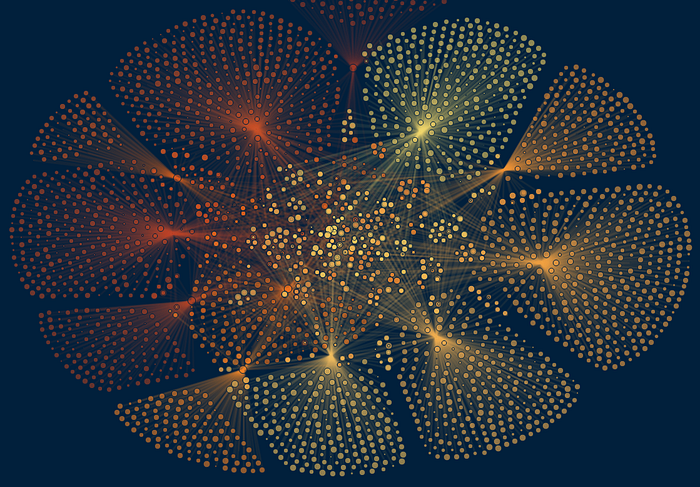
I wanted to see how many enemies and friends crossed paths with more than one regeneration of the doctor. I had never created a network graph before, so the first thing I did was Google how to create one so could get an idea of how to prep the data. I found Rajeev Pandey’s blog which was a huge help in figuring out how to make this graph.
The first step is getting the data in the right format.
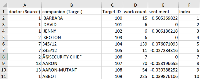
I’ve uploaded the data files here for you to download and follow along with.
For any network graph you need a source and target column. The Source column is what your main nodes will be. In my case, my source was the Doctor because I wanted to know who the Doctor spoke to. The target is what the nodes will connect to. For my graph the targets are the people the various Doctors talk to. You will need a unique ID for both the sources and the targets. In my case I used the regeneration number for the Doctor ID (so William Hartnell is 1, etc.). There are 13 doctors so the ID is 1–13. I started the IDs for the Target at 100 so that there was no overlap of ID numbers between the source and target columns because I did not have overlapping data in my source and targets. If your data has values that are in both the source and target columns (for example, if you want to see who killed who in Games of Thrones, you may have someone as both a killer and a victim) then the ID for that character needs to be the same in both the source and target columns. The data file shown above is the Cleaned Data File that I will reference throughout the blog.
So how to create that cleaned data file? I used R for my data prep. One thing I love about creating Tableau Public vizzes is that I get to practice both my Tableau and my data prep skills.
The data I had was a row for every character, the sentence the character spoke, and the Doctor ID of who they were speaking to. To get the word count I used the “sentimentr” package (I used this to size the nodes based on how many words the characters spoke). The code below created a dataframe that has the word count and sentiment of every sentence (which were in a column called text) from the data source.
df2<-sentiment_by(df1$text, by=NULL)
From there, some basic cleaning was done to clean the target names (the people who spoke to the Doctor), such as removing text that were enclosed in brackets, parenthesis, etc. and removing things such as “1ST ” from “1ST SOILDER” or trailing numbers (such as DALEK 2) so I could get a better understanding of how many times the Doctor speaks to any Dalek or Solider, not specific ones. The final step was to group everything by Doctor and target.
df3<- df2 %>% group_by(target,doctor) %>%
summarise(sum(word_count),mean(ave_sentiment))df3$index<-1:nrow(df3)
This gives me columns A,B, D, E, and F from the Cleaned Data File above. Great! Now I need unique IDs for the targets. For that I took the data from column B and copied it into a new Excel sheet. From there, I went to the Data Tab and removed all duplicates, then created an ID row starting at 100 and counting down.
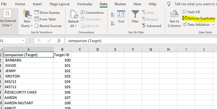
I used a VLOOKUP to add that Target ID variable back into the data set (Column C). Finally, be sure that there are not two rows with identical sources and targets. For example, I should not have two rows that both say “Source=1, Target=AMY.” Each row must be unique for the network graph to work. You can check this by doing the “Remove Duplicates” command in the Cleaned Data File, de-duping on both Target and Doctor (Source).
Now that I had the basic data prepped, I needed to create the network graph. Network graphs in Tableau are created by getting the X and Y coordinates of each dot of the network graph, plotting them, and connecting with lines. For small network graphs you can manually assign X and Y coordinates, but I had over 3,000 lines of data, doing this manually was not an option. So instead I used Gephi, which I learned about through Rajeev’s blog. Gephi is an open source software that creates a wide variety of network graphs, and definitely something I want to continue playing with in the future.
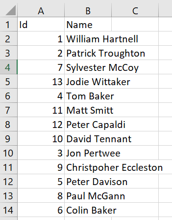
Gephi needs two data files to create a network graph: a nodes and an edges file. The nodes file is straight forward: it just needs the source (node) IDs and name. The screenshot is the nodes file from the Doctor Who viz. For this viz the Nodes are the doctors because I am looking at who the Doctor talks to. Be sure to save this as “Nodes” and in a CSV file with the columns labeled “Id” and “Name.”
The edges file is a bit more work, but nothing that can’t be done if you’ve made it to this point. It needs 4 columns: Source, Target, Weight, and Type.
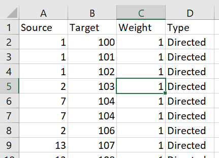
The Source column is column A from the Cleaned Data File above (the IDs of the Doctor, the basis of the network chart). Column B is the Target ID (Column C) from the same Cleaned Data File. Weight will always be 1 and Type will always be Directed for this kind of network graph. Save this as a CSV named “Edges.”
Now you’re ready to use Gephi!
When you open Gephi, you’ll select “New Project” from the pop-up window.
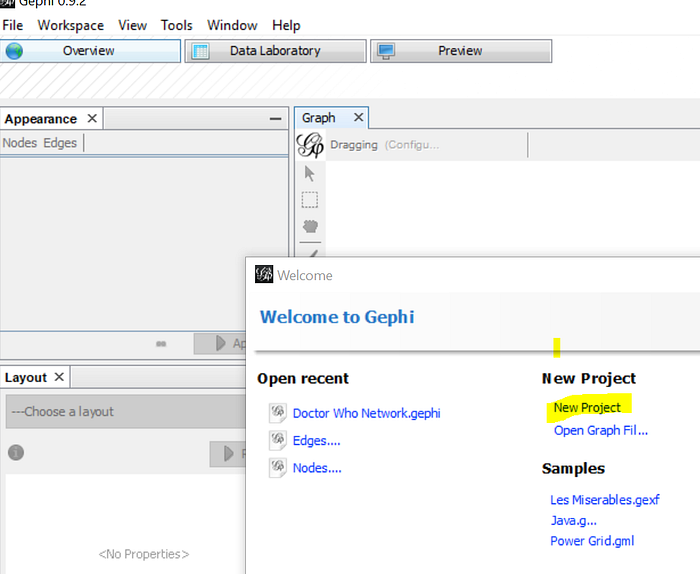
Then go to “Data Laboratory.”

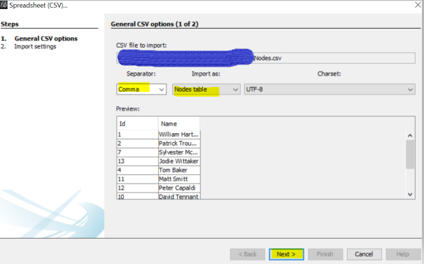
From there, you’ll import your nodes and edges spreadsheets. Click “Import Spreadsheet” and select your Nodes CSV.

Be sure to select that it’s a Nodes table then click Next.
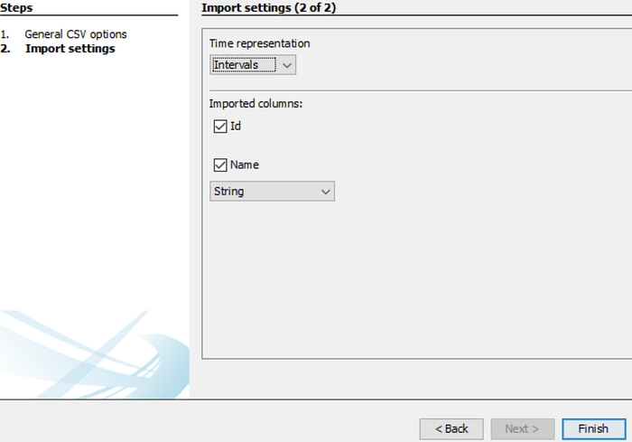
Make sure ID and Name are checked, then click Finish.
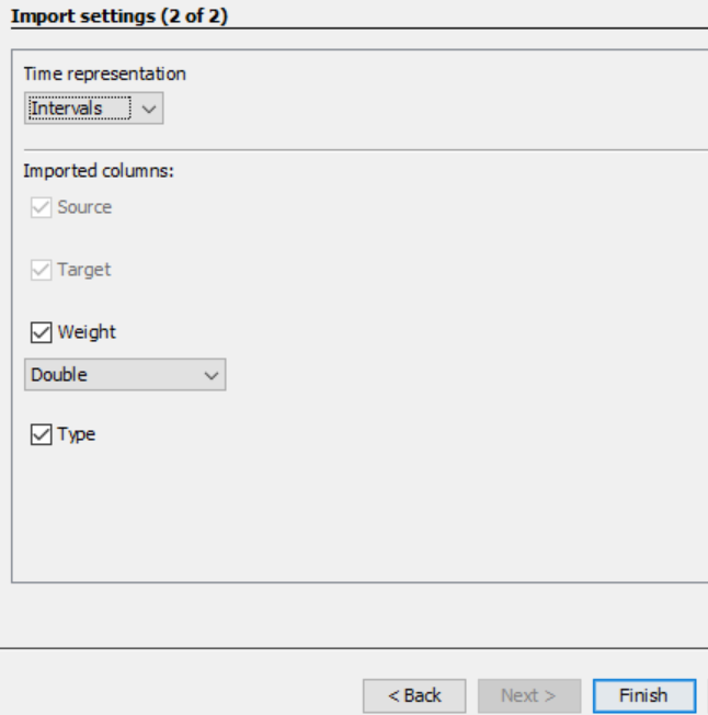
Once that’s done, you’ll click “Import Spreadsheet” again and select your Edges CSV. Be sure it’s importing as an Edges table then click “Next.”
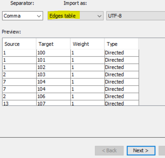
Make sure everything showed up on the next screen, then click “Finish.”
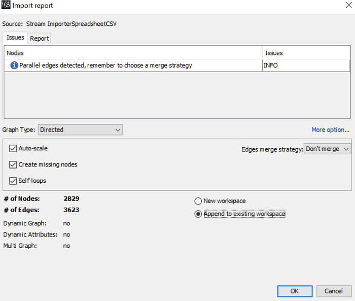
Once you click Finish, a pop-up will appear. This is going to be a summary of your network graph. The # of Nodes is the number of circles that will be in your graph. The # of Edges is the number of lines (since for this analysis multiple regenerations of doctors talked to the same people, I have more edges than nodes). Be sure you select “Append to Existing Workplace” and then click “Ok.”
Next, click “Overview.”

Initially, it will look like this:

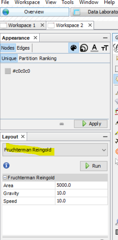
Don’t worry! The layout options are in the bottom left and these are what you will use to create the network graph. There are a lot of resources out there about the theory behind each layout, but I honestly just starting picking layouts and then hitting “Run” to see what happened. An important note: the layouts won’t ever “finish.” They just keep running iterations that make small adjustments. So once the graph looks how you want it to then you’ll just hit “Stop.” You can adjust the speed if your network graph is taking too long to calculate, and playing with the gravity and area will help make the graph more spread out or compact.
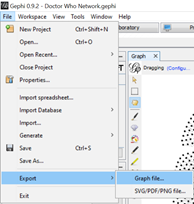
Now you have a beautiful network graph, but what you really want are the X/Y coordinates of each point. So to get that, go to File -> Export -> Graph file and save as a .gexf. This will save it as an XML file.
To open the file, open a blank Excel workbook and open the gexf file as an XML table. You’ll get this pop-up, and maybe a few others, be sure to select XML and then click “Ok” each time.

Your file will look like this:

The columns you need are id3, value, x, and y. Open a new sheet in in the Cleaned Data File, and save the id3, value, and x/y coordinates for the ids that are from your Nodes file. So for this I would just save the rows that have an id3 of 1 through 13. Save this sheet as “Nodes” and rename the id3 and value columns whatever you want (here I renamed to id3 to Doctor ID and value to Doctor name).
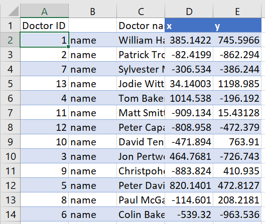
Next, in your Cleaned Data File from above, map over the X and Y coordinates using a VLOOKUP based on the Target ID. Rename X and Y to X Target and Y Target and name this sheet “Tableau.”

The next step is to duplicate your data so you can create the lines in Tableau that will connect your dots that were created by the X/Y coordinates. Create another column called “Base” in the Tableau sheet and fill it all the way done with “1”. Make a second column called “Direction” that concatenates the Target and Source columns with an arrow in-between. So mine comes out as “William Hartnell -> AMY.” The concatenate formula in Excel can do this easily, just be sure that once you copy the formula down you copy and paste as values, so that when you duplicate the data (next step) the formula doesn’t change.
The next step is duplicating the data. Copy the entire dataset and paste it below the original data. In the Base column of the copied data, replace the “1” with a “2” all the way down so you know which half of the data is the original and which half is the duplicated. In the half where the Base equals 2, switch the names in the Target and Source (for this example, you’ll switch the Name and the Doctor Name columns). Note: your Direction column should still match exactly how it is in in the half of the data that is Base 1. You’ll have a data set that looks like below in your Tableau sheet (I have some extra columns, but the ones highlighted are what are important).

Tableau time!
Now you’re ready to join in Tableau! Bring in both the Tableau and the Nodes sheets and join on your Nodes ID (for this dashboard the join is on Doctor ID)
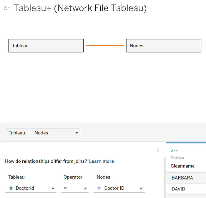
You’re going to need to make an adjusted X and Y coordinate to create the lines in Tableau. If you just plot X Target and Y Target from the Tableau spreadsheet you’re just going to get a set of overlapping dots. This is because when you duplicated your data, your X Target and Y Target for the data in Base 1 and Base 2 are identical. What you need is a coordinate for the node and a coordinate for the target. To do this, create an X adjusted and Y adjusted calculated field:
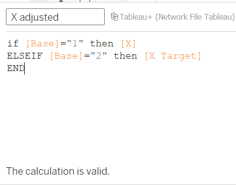
X adjusted
if [Base]=”1" then [X]
ELSEIF [Base]=”2" then [X Target]
END
Y adjusted
if [Base]=”1" then [Y]
ELSEIF [Base]=”2" then [Y Target]
END
Remember, the [X] comes from the Nodes sheet and the [X adjusted] comes from the Tableau sheet. The reason for this calculation is to get a node and an edge that will connect. Your data will now look like this:

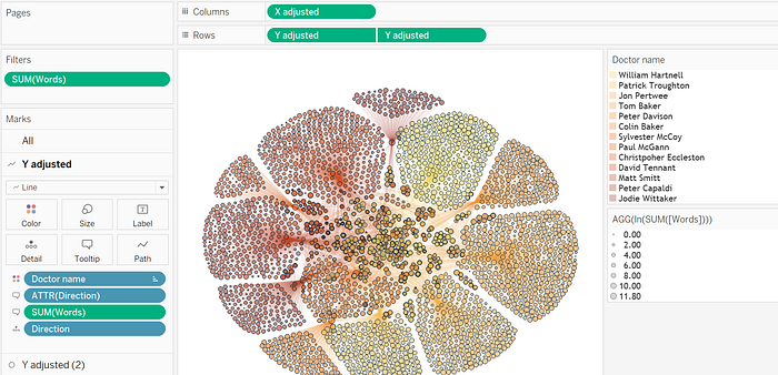
As you can see, the Doctor Name for Base 1 and 2 are different because of the data prep you did in Excel. However, the direction is the same for both. The X Target and Y Target that comes from the Tableau file are identical because you just duplicated the data in Excel, but when you create the X adjusted and Y adjusted calculations you now have two sets of coordinates, which you’ll connect using a line. The set up in Tableau is fairly straight forward at this point. You’ll put X adjusted on columns and do a dual axis for Y adjusted.

For the Y adjusted, change the first one to Line and add the Direction calculation on Detail.
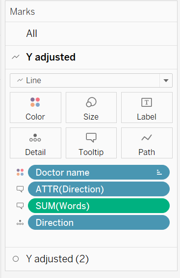
Now you have a network graph! You’ll want to adjust the opacity of the lines and circles so you can see the network clearer. Then it’s just a matter of adding color, cleaning up tooltips, and adding to your dashboard!
The final viz!
Thanks for reading this tutorial all the way through. I hope you’re able to use this to create some amazing network graphs. If you have any questions please reach out to me on Twitter @NicoleKlassen12.


