Design Delights: White Space (with bonus tip: using padding to create a navigation menu)
Welcome to Design Delights! In case you don’t know me, I am a data visualization developer with many years of experience visualizing in Tableau. When people ask me what the most challenging part of learning data visualization is, or the hardest part of learning Tableau, I always say, “Effective use of white space.” People expect me to say things like Level of Detail calcs, or the trigonometry needed to make a Sankey, but there are many great resources on how to master those. However, I’ve noticed a gap in formal software and data viz training around design. The idea of “design” can be an afterthought in these courses, if it’s shown at all. So, I’m going to start a series on some quick design delights you can use to help drive dashboard adoption. The first of these will be white space.
Why care about white space? Or design in general? Design and effective use of white space can be the difference between a highly utilized dashboard and one that languishes. So, let’s dive in!
What is white space? White space is “the space on a page that is not occupied by any text or graphics. Beginners tend to be afraid of white space; professional designers use lots of white space.” (Williams, The Non-Designer’s Design Book).

In data visualization, especially Tableau, white space isn’t inherently built into the design functionality. There are a few ways to consider white space in your next visualization:
- Requirements and Specifications Gathering. I know what you’re thinking; “wait, she said she would talk about white space. Why are you talking about requirements gathering?” Because requirements gathering should involve more than “what do you want?” Ask questions about who the primary and secondary audiences are and what problems they are trying to solve by implementing this dashboard. You could get a request to track 10 metrics, but by understanding the problem they’re trying to solve, you can use some math magic and produce three metrics that get to the heart of their problem. Cutting down the dashboard requirements gives you more room to include white space.
- Wireframing. Once you have the requirements, I find it helpful to start wireframing to create an optimal layout with plenty of white space. Wireframing can be done digitally, with programs like Figma, Miro, and PPT, or you can do it analog with pen and paper. No matter how you do it, keep whitespace at the top of your mind. Incorporate margins, padding, and layout that will optimize flow. I found it very helpful to learn more about “designing and building to a grid;” this idea of building to a grid has helped me optimize my dashboards for the best user experience, encouraging people to use my dashboards.
- Pay Attention to Padding. In Tableau, most objects are brought onto the dashboard canvas with a padding of 4, and the main dashboard has an outer padding of 8. Don’t be fooled into thinking there is enough space between objects; play with the padding! Add inner padding on text boxes and charts so they don’t hug the edge of the objects, and add outer padding to all objects so there is space for the elements to breathe. Using a tiled dashboard can help ensure equal and adequate whitespace when used with thoughtful containers and padding. I usually start with a default of 15–20px padding between objects, then increase as necessary. Using the “Distribute Contents Evenly” container functionality can also help ensure there is enough padding around objects. I’ll talk more about Tableau’s padding below.
- Come Up With A Style Guide. Your style guide doesn’t have to be fancy. But writing down that you will have 80px margins, 20px padding between objects, filters 50px tall, etc., will help ensure your dashboard has enough white space and a uniform layout.
Tableau Padding
Tableau’s padding can be found on the “Layout Tab” of your dashboard.

You’ll see here that it has an outer padding of 8 and inner padding of 0. What is the difference in inner and outer padding? I’ll show you! And then I’ll show you how to use it to create some cool navigation menus.
Padding Defined
Tableau says “Inner padding sets the spacing between item contents and the perimeter of the border and background color; outer padding provides more spacing beyond the border and background color.” What does that mean in practice? Say we have the navigation button below. It has zero padding, and it is sitting in a blue container.

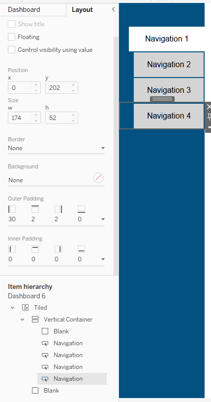
When I change the outer padding, you’ll see the height of the button is still 52 px high, but you can now see the blue behind it.

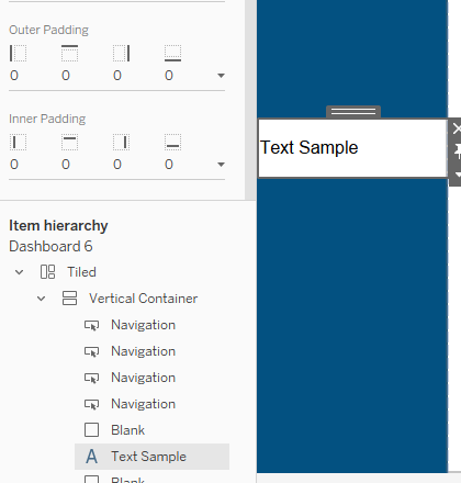
I use inner padding a lot on text boxes. Here’s a text example with a white background and no padding, in that same blue container.

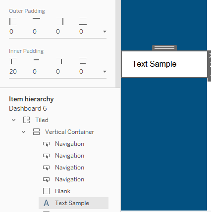
If I change the inner padding on the left, the font won’t be so close to the left edge, but the entire box is still white. If I had changed the outer padding, it would look like the buttons above and the left side would be blue.

Padding in navigation
So how can we use padding to make some user-friendly navigation tabs? Let’s look at the example below.

Right now, I have dropped a vertical container onto a blank dashboard, and then added a blank shape to the dashboard as well. Right now, I have the “Tiled” main dashboard selected, and you can see it has an outer padding of 8. This is a Tableau default, and it’s the reason you can see a thin, white border around the blue container.

Now, I’ve removed the 8 outer padding (set it to 0), and the thin white border is gone. Now my blue container sits flush against the far left of the dashboard. You can see that I’ve selected my vertical container, and it has no padding. We’re going to use this to set up some navigation buttons. Let’s get started!

I’ve added four navigation buttons to my dashboard. These are all text navigation buttons, not images. You can see, they come in with a default of 4 outer padding on all sides. This is why you can see the blue container outlining each white button. Let’s say right now, we’re on Dashboard 1. How can use use padding to make this navigation a bit more UX friendly?
First, we’re going to color our non-active dashboard buttons gray, and keep the dashboard we’re on as white.

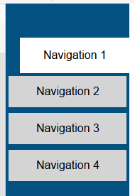
Now, let’s play with padding. I am going to remove the right outer padding of button 1, and play with the other padding to get this look:


For the other buttons, for the sheets I’m not on, I’m going to change all their padding as well:


Each other navigation button has the same padding. Now it’s clear to the user which tab they are on, and as the user switches from dashboard to dashboard, it’ll have a clean looking and feel.

You can change the padding however you want, but this way you don’t have to play around with custom images or anything for your buttons to give then borders on only 3 sides. You can use padding instead!
Ellen Blackburn’s Tableau Public account is full of amazing vizzes with excellent use of white space. It makes her dashboards easy to read, and keeps readers engaged, instead of them being overwhelmed with text and charts stuck together. Be sure to check out her profile for white space inspiration; many of her vizzes are downloadable, so you can see what kind of spacing she uses.

Hopefully, this will help bring white space to the forefront of your dashboard designs. Stay tuned for more design tips and tricks soon!
For more information on design and how to implement white space, check out Robin Williams’ book The Non-Designer’s Design Book. Also, check out this blog for more examples and tips: https://nonprofitviz.com/60-second-data-tips/tag/white+space
