Scaffolding Tricks for Non-Date Data
Scaffolding data is an amazing tool to make sure your visualizations and analyses give the end user the information they need. Scaffolding data is a way to fill in any gaps in the structure of your data. The most common use case is for dates; most data systems only have date rows for when something occurred, and don’t have a row for every date in the year. For an intro to scaffolding and date scaffolding, check out Ken Flerlage’s and Jim Dehner’s amazing blog posts!
I use scaffolding all the time, but not for date data. I was trying to help another analyst understand what scaffolding was and how to use it when you need to structure categorical data, and all the blogs were around scaffolding for dates. So I decided to put together some scaffolding examples that I have used: categorical information and structuring metrics.
You can download all the files used in these examples from Google Drive: https://drive.google.com/drive/folders/1mwr3bDerK-tqqb-rPMJuCdXdYnxyCh10?usp=share_link
Example 1 — Demographic or other categorical information: Just like dates, many systems only contain a row when data are present. With person-level data, that means you have one row per person. When trying to visualize demographic data, such as race/ethnicity, sexual orientation, gender identity, etc. there may be times when there is no row of data for a certain characteristic, especially in small populations. This uses the Main Data Source Excel file from the Google Drive folder.
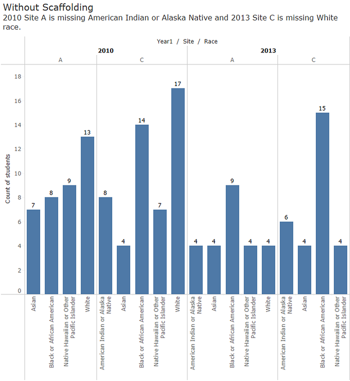
In the example above, in 2010, site A had individuals with all races but site A is missing American Indian or Alaska Native. In 2013, site C is missing White. But because there are no rows of data with people in those races, there are no bars, not even a 0.
Sometimes you can get around it by going to the Analysis tab -> Table Layout -> Show Empty Rows/Columns, but depending on your visualization that may not always work. Also, I have found that some users get confused with a blank row, not realizing that a blank row means 0. That’s where scaffolding can help.
Scaffolding to fill in demographic/categorical information works the same as scaffolding with dates. You have your main data source, and a scaffolding data source that has all the options (in this example, all race categories). The scaffolding file comes from the Scaffolding Example file on Google Drive.
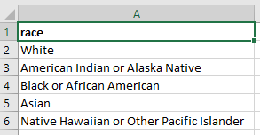
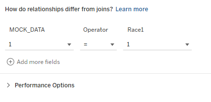
Each tab has every possible option for each category, and you join it with the main data source using a join calculation of “1”. From there, follow the same steps as Ken’s blog to make that every category will show in your viz, even if there isn’t any data in main data source.

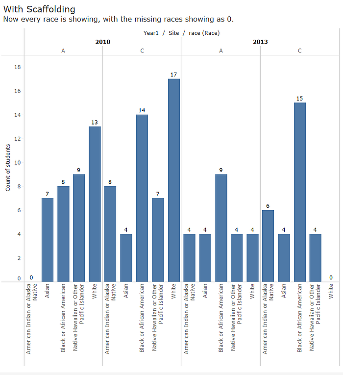
And voila! You now have a graph that explicitly shows your users which years demographic information is missing. This can be done for any categorical data.
Example 2 — Structuring Dashboard Metrics. Sometimes clients need tables or visuals set up in ways that aren’t easy in Tableau. No matter the reason, from personal preference to reporting requirements, the table needs set up in a way that would require measure names/values to be place on both rows and columns, which isn’t possible. This could be things like aligning donut charts in a certain order or creating a goals dashboard like the one below:

Or a dashboard that has N and Percent set up across the top:

Each metric is a measure, and so are the N and %. You can’t have measure values on both columns and rows, you need the metrics to be in one dimension. Since your data aren’t structured this way though (and you cannot get a custom table/view/data set built), scaffolding comes to the rescue! I start by creating an Excel file with all the metrics I need for the dashboard.
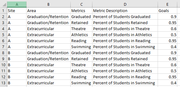
In the same Excel file, add in tabs for any dimensions you may need to filter by on the table. For example, if this is a tracking dashboard and you want to be able to filter by gender and location, you’d add tabs in the scaffolding file just like the first example.
Next, you bring this file into the same Tableau workbook as your main data set as a new data source. Then you’ll blend the two data sources together based on any joining fields you have. In the example below you have the main scaffold files and then extra tabs for Age, Ethnicity, Gender, Race, and Site that will be filter options. You have to be able to blend on at least one categorical variable.
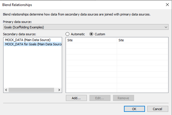
The final step is to build the N and % calculations. These will be built in the Metrics data source; the Main Data Source with the actual variables will be the secondary data source. Here’s an example of an “N” calculation:

You’ll notice that since it was built in the Metrics data file, the values for N come from the Main Data Source. They have to be summed, you can’t use this technique if you need distinct counts from your data. Once you have the N, you create the % calculation the same way. Now you can structure the data however you need.
— — — — —
Scaffolding is a powerful tool to take your analysis to the next level. Let me know what other use cases you all have for data scaffolding!


