Telling a Story with Your Data
First, let me say that I love poster-style dashboards. Just take a look at Jennifer Dawes and Chimdi Nwosu’s profiles to see some amazing examples. It’s also important to note that I only use storytelling techniques with my Tableau Public community projects; these tips don’t apply to business dashboards. What tips, you ask? Tips for creating a medium or long-form storytelling viz!
My favorite dashboards to create are ones that focus on telling a story. I come from an academic research background, so I build my dashboards as though they are a visual literature reviews. USC defines literature reviews as:
“A literature review surveys books, scholarly articles, and any other sources relevant to a particular issue, area of research, or theory, and by so doing, provides a description, summary, and critical evaluation of these works in relation to the research problem being investigated. Literature reviews are designed to provide an overview … [on] a particular topic and to demonstrate to your readers how your research fits within a larger field of study.”
That’s a long way of saying that a literature review involves reading a bunch of articles around a topic and then writing a concise paper that brings everything together to tell the reader why they should care about your topic or issue.
These same principles are used to create storytelling dashboards. Data tells us what happened or is happening. By researching the topic the data was collected for, you can add context to your dashboard to tell your reader why these data are important and why they should care (and depending on the topic, how they can help support the issue). When starting to read through articles, it’s important to use credible sources to craft your story. There are a couple ways of doing this:
- Use Google Scholar. Google Scholar searches all published research journal articles about your topic. Sometimes it does bring back articles that are behind a paywall, but usually you can read the abstract of those articles and that may give you the information you need.
- Do a general web search. Newspapers and magazines are a great place to get information, but there are a lot of others too. Large nonprofits tend to publish some comprehensive reviews about the topic they support every couple of years. For our Climate Change dashboard we used articles from the UN. Even Wikipedia is becoming more and more credible.
When I build a storytelling dashboard, the steps I follow are below:
Pick a topic. This should be very broad, such as “Gender and Climate Change.” If you already have a data set then your topic would a broad stroke about what the data covers. Your topic ideas can come from anywhere! It may be something you’re passionate about or something you come across in an article or book that sparks your curiosity. I built my Next to Normal dashboard because I absolutely love Next to Normal and wanted to share that love. The Women Composers in Western Music came about because I read an article that said only 1.8% of the pieces performed by America’s largest orchestras were composed by women and I wanted to learn more about the inequality in other areas as well.
Look up research and articles about that topic. Start reading articles using the sources mentioned above and save the ones that talk about your topic. It’s always a good idea to see if there is information on the topic broken out by various populations as well (ex. different counties/countries, income levels, gender, race/ethnicity, etc.) because sometimes aggregated data can hide a bigger issue, and you can include that in your story. This is also when you’ll pull any additional data you need to create your story. Usually it’s small, aggregated data tables that you copy into Excel, but it’s great context and can be used to say whether your data is showing positive or negative trends. Some articles do link to their data sources as well that are publicly available. This part is the longest part for me. I can spend hours going down rabbit holes, trying to paint a full picture of the topic. One article will mention something that sparks curiosity so I go find more info on that piece of the story. But this is also my favorite part. I learn so much, both about the topic but also I tend to find new data sources that may spark ideas for a new dashboard.
Find and explore the data. Once you find your data, do some exploratory analysis and see what you find. See how what you found fits in with the literature. This will help you in creating a research question. You may need to go back to the previous step once you’ve looked through your data and pull more supplemental information.
Create your research question. Now that you have data and some literature, you can narrow your focus to a specific question that you want your dashboard to answer. It can be easy to create a broad question because there is so much research available, but try to make it as narrow as possible. This will allow you to tell a thorough and concise story that will draw your reader in rather than turn people away because it’s too long. You can always include a “for more information check these sites out” at the end if you need.
Create your outline. Start to pull your story together to answer the research question. I usually change my outline 4 or 5 times as I pull in journal articles and findings. Think of all the questions you had when you were looking up research, and use those as the basis of your viz. Assume that the person looking at the viz has no prior knowledge on the subject, and create a compelling story based on the data and research that will make them care.
Create your design. This is one of my favorite parts, behind research, and to do it justice I will talk about this more in another blog post. Stay tuned!
Create your viz! I love using BANs for storytelling; for me they are like the first sentence in a book. They draw the reader in and tell them why they should continue reading. And be sure to site your sources throughout.
So what are some examples?

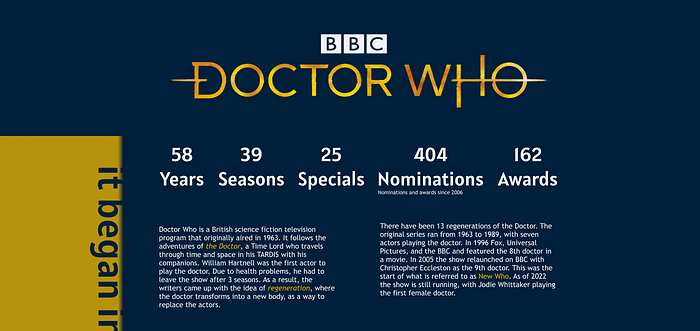
This is an example of a viz that only used 1 or 2 outside sources. In my Doctor Who dashboard, the original topic I had in mind for this dashboard was Doctor Who and the people they meet. I found a great data set on the Kaggle website with the scripts and expanded that topic to the people they meet and the places they go. But I wanted people who knew nothing about the show to still be able to understand and enjoy the viz, so I pulled some data from Wikipedia on the show and used that for the BANs and intro paragraphs. This viz had very little external research, but what I did add in helped bring the reader in and tell an actual story.

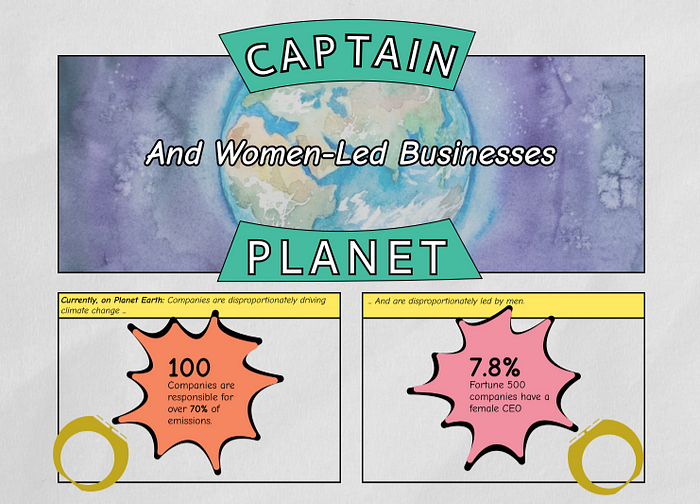
This viz went very heavy on the research to form the story. For my Captain Planet viz I took a very different approach. I had a topic in mind: Climate Change, gender inequality, and the way businesses are impacting both. I knew there was World Bank data on a lot of this, but I wanted to know more about what was impacting the data. So instead of starting with World Bank, I started pulling articles. I read at least 40 articles around the connection between climate change, women, and business. I pulled the initial BANs from one of those reports, the data on how climate change affects women from another, etc. I knew from the research I read that women were being kept out of large climate change conversations, so I specifically looked for information on the climate financing boards and COP delegations. Then I used the information from the articles to inform which metrics I pulled from the World Bank. When you’re taking on a topic around social justice or inequality it’s always good to end your story with some hope and a way for people to support the cause — a call to action.

The last example I want to talk about is my Next to Normal viz. This one was a middle ground between the other two in terms of how much the data vs. research created the story. My overall topic was an in-depth look at the musical Next to Normal. I had data on the music from Spotify and sentiment analysis on the lyrics. But I still wanted some overall stats to tell people why they should care about this musical and some information on why having accurate representations of mental health in media is so important, because that is one of the reasons this musical did so well. I found a website that has all the production data from Broadway shows and used Wikipedia to add context to those numbers as well as pull in other information such as where it has been performed and nominations/wins. But most of the research was done looking through journal articles on Google scholar about grief, bipolar disorder, and emotional abuse/neglect, to give more context to the characters and show how detailed the authors were in their portrayals.
Telling a story through data viz is a powerful way to educate, bring attention to important causes, or get people excited about something you love. If you haven’t already checked out Kimly Scott’s profile you are missing out, she has absolutely amazing storytelling dashboards. If you have any questions you can always DM me on Twitter at NicoleKlassen12. Happy storytelling!
