Tell me a story! Helping people see the stories in business dashboards
I have re-written this blog several times. I started by outlining the importance of telling stories in business dashboards; then reworked it because I saw a lot of conversations about how dashboards shouldn’t tell stories and started second-guessing myself, but finally I decided to stand by my original thought that YES, we DO need to tell stories in our business dashboards. They just look a little different than we think when we think of storytelling. Let me tell you why ❤️.
I love telling stories using my Tableau Public dashboards. I have a whole post written about Telling a Story with Your Data. But those are all fairly static dashboards where I have the data, have the story, and am telling it to you. Business dashboards are different; I’m thinking of the dashboards that are usually connected to a live data source, have multiple filters, and in general are created so users can monitor some aspect of their business. It can be easy to think there’s no way to tell a story in business dashboards; instead, they should be used for finding stories. However, if our dashboards don’t tell the story of the business as it is now, our users will never find the important stories that will improve the business. Why do I think that? And how is that possible?
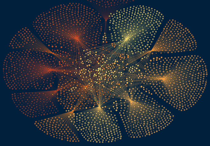
In a story, there needs to be focus on the core message, the values, the analysis, the identity, and the action, as this image from J. Moreno (2015) outlines. All of these are important for our business dashboards, as outlined below.

- Core: Keep your dashboards within the company-brand style guide, include company/department logos, and give your dashboard titles that tell your users what to expect.
- Values: Include metrics that reflect and drive the values, mission, and vision of the company or department. We’re in a numbers business, which can be seen as cold and analytical. Let’s remember that the numbers represent real people, real ideas, real products, and treat them as such in our analyses.
- Analysis: Lots of decisions get made around common assumptions; include metrics that will inform those assumptions, even if they disrupt them.
- Identity: Are there benchmark or comparison data you can include that will identify where your company stands? These can be used to celebrate where you are or give targets on where you want to go.
- Action: How can you arrange your metrics in way that get people to take action based on the data? Can you add more text to the dashboard to help orient people to what the data are saying so they can quickly see key findings?
When I have created business dashboards for clients, I spend a lot of time working with the subject matter experts, learning about their needs to be sure I build a dashboard they can use. However, I was noticing that I was still getting really low engagement; I built the dashboard, trained them on how to use it, and then no one opened it again. When I asked them why, I was told “I can’t find the story in this.” I learned that there can be a huge disconnect between analysts and the subject matter experts when it comes to knowing how to use and read a dashboard. Data literacy, graphicacy … whatever you want to call it, we may be experts but our clients aren’t necessarily. And that’s ok; it’s our job to be the expert. But it’s also our job to give the client what they need in a way they can understand. I’ve been specifically asked to build monitoring dashboards that tell a story; not just a group of charts that people can look at.
Dashboards are intuitive for analysts, but many end users aren’t analysts. We may scoff a little when a client insists on a pie chart, but it’s important to remember that we all grew up seeing pizzas, pies, etc. and we know that a bigger slice is better. We also know how to look at stacks of things like books; this is why bar charts are so easy to understand. But line charts aren’t necessarily as intuitive to everyone. Data viz was meant to translate numbers to pictures, but that translation is easy to get lost. Hieroglyphics are 100% pictures but I don’t know what they say. Text can be the bridge to help people understand what they’re looking at. The order of charts can help people understand the context of the numbers. While our dashboards may not tell THE ONE important story, it does tell the story of the business and from there clients can find the key stories they can act on to improve the business.
So what can we do to help tell a story in our business dashboards?
- Organize the dashboard that facilitates storytelling.
Help the user get oriented to the story by starting with the big picture/background information/context first. Usually this is done with BANs and a strong dashboard title. From there, get into the details. High level to smallest level. For example, you can start with some company-wide metrics and then department-level information. This will help your user understand the story of what’s going on in the organization so they can find the key metrics they need. - Keep each dashboard to one topic.
It’s easy to add lots of metrics to dashboards, but that can lead to users getting lost. Be sure each dashboard is telling just one story, like chapters in a novel. You can build multiple dashboards as needed with navigation so that if a user needs to see something else they can, but if they open a dashboard and are just overwhelmed then they’ll close the dashboard and never open it again. - Use text!
I feel like in business settings we can be afraid to add text, especially since our numbers can change daily or with each filter update. But adding dynamic text helps orient the reader better than any additional chart will. This can be done by having a dynamic title and/or dynamic subtitles. The way I do this is usually title a chart, maybe “Sales Trends Over Time” and then add a subtitle that is dynamic such as “Arizona has the highest sales in 2021.” The words “Arizona,” “highest,” and “2021" all change based on the selected filters and parameters. This orients the user to what the chart is showing and what insights they can glean. And once they know how to read the chart they can find the key story, such as lowest sales area. - Keep the Core, Values, Analysis, Identity, and Action at the forefront at all times. Use these story elements to guide your dashboard build. Use them to tell the story of the business as a whole, so that the subject matter experts can use the data to improve the story.
Visualization is in the title of our profession; we focus on visuals. But we cannot assume that just because we understand visuals that everyone will. We’ve stripped so much text from our charts that our users can’t understand the story we’re trying to tell and therefore they cannot find THE STORY needed to help the business. So let’s get some text back and have a story telling focus in all our dashboards!